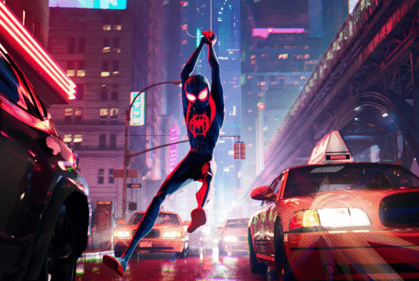
Top 12 Motion Graphics Video Examples You Need to Watch
Introduction
Attention is currency, and it must be earned. With a more discerning audience, content needs to be the total package to even get a click, and have a tasteful blend of clarity, pacing, and visual appeal. Here’s where motion graphics come into play. Unlike live-action or static visuals, brands can use motion graphics to tweak every detail with precision, from rhythm and focus to the flow of information. Done well, these graphics help viewers understand ideas faster, remember messages longer, and stay engaged without feeling overwhelmed.
The main challenge of motion graphics is being able to communicate clearly in a limited amount of time and space. The strongest examples of motion graphics do this by getting three things right: they guide attention, reinforce meaning, and simplify complexity.
In this article, we’ve rounded up 12 of the top motion graphics videos you need to watch. Each one demonstrates how timing, visual structure, and motion, can support storytelling across objectives and industries. Along the way, we’ll extract practical insights that you can apply to everything from brand campaigns and animated ads, to corporate videos and SaaS product demo videos.
- Adobe Daily Creative Challenge
- UEFA Nations League
- OCBC STACK Rewards
- Slack
- CoPilot AI
- FGV Corporate Video
- PayPal
- Cloudflare
- Reddit Mobile App
- Dr. Bill
- Herman Miller
- Microsoft Whiteboard
1. Adobe Daily Creative Challenge
About the Project
This short motion graphics piece is used to introduce Adobe’s Daily Creative Challenge series. It acts as the opening visual for each broadcast, setting the tone before the challenge content begins.
Why It Works
The animation is brief but has a set purpose. In this case, motion is used to establish energy and creative momentum rather than convey any detailed information. The clean transitions and rhythmic movement help signify that this is a repeatable series, helping viewers recognise the format while still being visually engaging. It also sets the daily challenge as an event, allowing it to feel like a familiar countdown to an IMAX film.
Key Takeaway
Motion graphics are highly effective for creating visual consistency across recurring content. Even short animated openers can build familiarity and elevate a series like Adobe’s daily challenges without requiring complex storytelling.
2. UEFA Nations League
About the Project
This motion graphics video explains the structure, rankings, and format of the UEFA Nations League in under two minutes, targeting both football fans and general audiences.
Why It Works
Minimalist graphics and consistent visual language keeps attention focused on structure rather than spectacle. Instead of a smorgasbord of clips with football stadiums bursting with excited fans,simple motion graphics guide viewers through rankings, divisions, and progression step by step, ensuring comprehension for those unfamiliar with football tournaments. The deliberate pacing allows each concept to land before moving on, preventing confusion despite the density of information featured throughout the video.
Key Takeaway
This video highlights the strength of motion graphics as an educational tool. When movement is used to sequence information logically, complex systems can be understood quickly and confidently.
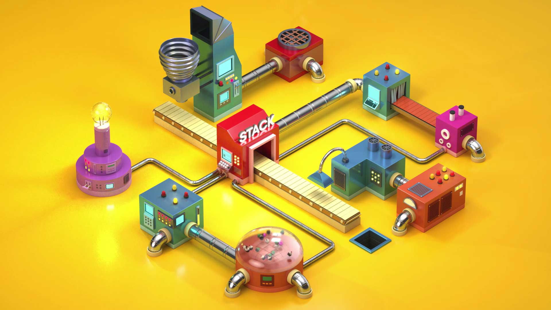
3. OCBC STACK Rewards
About the Project
This motion graphics video explains OCBC’s STACK Rewards platform, which allows users to combine multiple rewards and benefits across different banking products. The aim is to simplify a complex financial system and present it in an accessible and easy to follow manner.
Why It Works
Motion is used consistently throughout the video to guide attention rather than overwhelm it. Animated elements act as clear visual metaphors for rewards and stacking mechanics, helping viewers understand abstract ideas without relying on dense explanations. Transitions are paced deliberately, allowing each concept to land before the next appears. The overall rhythm keeps the viewer oriented, making the experience feel smooth and intuitive from start to finish.
Key Takeaway
This example highlights how motion graphics can reduce cognitive load when explaining complex systems. By using motion to clarify relationships and progression, brands in any industry can make complicated ideas feel more approachable. This approach is especially effective when the goal is to build understanding quickly rather than impress with visual complexity.
4. Slack
About the Project
This motion graphics video introduces Slack as a communication platform designed to reduce workplace friction caused by emails, meetings, and fragmented tools. Aimed at teams across industries, it positions Slack as a more organised and pleasant way to work.
Why It Works
With just the use of simple shapes, consistent iconography, and a limited colour palette, ideas are easy to follow. Motion is used to reinforce transitions between problems and solutions, helping viewers track how Slack fits into everyday workflows and thoughtful sound design further supports the animation, adding texture without diluting the message, as the frenetic nightmare of a workplace gives way to the pleasant life Slack could grant you
Key Takeaway
This example shows how motion graphics can amplify simple ideas through discipline. Clear structure, consistent motion language, and controlled pacing often make messages more memorable than visually dense executions, especially for productivity-focused tools whose core message is simplifying your life.
5. CoPilot AI
About the Project
This motion graphics explainer introduces CoPilot AI, a productivity-booster aimed at individuals and professionals alike. The video outlines the product’s value proposition and functionality with concise motion graphics.
Why It Works
The colourful visuals and dynamic transitions keep the video lively without sacrificing clarity or professionalism. Motion graphics are utilised to break down ideas into digestible segments, with animation reinforcing key points rather than distracting from them with overly flashy visuals. The pacing feels deliberate and not rushed, ensuring viewers can follow along if they are unfamiliar with the space, but quick and concise enough through smooth, snappy movements to ensure that viewers won’t lose focus.
Key Takeaway
Effective motion graphics balance energy with structure. Vibrant animation can capture attention, but clarity comes from controlled pacing and visual hierarchy, especially in B2B contexts.
6. FGV Corporate Video
About the Project
This corporate motion graphics video introduces FGV Holdings Berhad’s agro-industrial operations, sustainability efforts, and global reach through a continuous visual progression that reflects growth and transformation over time.
Why It Works
The animation uses a seed as a recurring visual metaphor, evolving into plantations, products, and global networks throughout the video, tying diverse business areas together into a single, coherent story. The smooth transitions and the evolving visuals help viewers understand scale and integration without relying on dense explanations or technical jargon.
Key Takeaway
Metaphorical motion graphics are powerful for corporate storytelling in animated corporate videos. When visuals evolve through motion, large organisations can present complexity as cohesion rather than fragmentation.
7. PayPal
About the Project
PayPal’s motion graphics video introduces users to its online and mobile payment platform, explaining how easy it is to sign up and use across devices.
Why It Works
PayPal is positioning itself as a simpler option to online shopping. To reflect that, the animation adopts a minimalistic design approach, with outlines, simple shapes, and straightforward transitions. Actions also flow smoothly from one step to the next, mirroring the intended user experience. By avoiding unnecessary visual embellishment, the video maintains focus on trust, reliability, and usability.
Key Takeaway
Motion graphics don’t need to be elaborate to be effective. When simplicity aligns with brand values, restrained animation can communicate confidence and reliability more effectively than with high-energy visuals.
8. Cloudflare
About the Project
This motion graphics video explains Cloudflare’s promise of fast, secure, and reliable internet infrastructure for a global business audience.
Why It Works
Cloudflare’s product isn’t a physical thing. You can’t hold it or really look at it, which is why illustrating it through motion graphics is particularly effective. Through the use of related imagery and smooth transitions, the video is able to showcase how data moves through Cloudflare’s network. The global network then reinforces the scale of it all effectively, taking an invisible process and explaining it visually.
Key Takeaway
Motion graphics are uniquely suited for visualising invisible processes. It can take an amorphous concept and make it tangible, and therefore easier for audiences to understand and trust.
9. Reddit Mobile App
About the Project
This motion graphics video promotes the Reddit mobile app, emphasising the idea that users can access communities anytime, anywhere.
Why It Works
The video embraces humour, bold colour choices, and playful illustrations that reflect Reddit’s community-driven identity. The motion is energetic but controlled, featuring seamless transitions that guide you through various scenarios without losing coherence. The space-themed visual icons reinforce the concept of using Reddit anywhere, while the bouncy transitions imbue the video with a sense of personality and quirkiness, imbuing the app with character. The end result is a light and engaging, but undeniably clear-cut motion graphics video.
Key Takeaway
This example demonstrates how motion graphics can express brand personality while still communicating function. Marrying the style of motion graphics with audience culture can help make engagement feel natural rather than forced.
10. Dr. Bill
About the Project
This motion graphics video breaks down a medical billing solution, Dr. Bill, designed to simplify administrative processes for physicians and healthcare teams.
Why It Works
Medical billing can be complex. However, this animation reframes it as a manageable, structured process, with clean transitions and clear sequencing to prevent the topic from feeling overwhelming. It fluidly visualises workflows and showcases how tasks are connected. Rather than oversimplifying the jargon, the animation focuses on clarifying each step without losing audiences in excessive detail. Compared to the other entries on this list, this video is relatively plain, but it showcases how even simple motion graphics can take a complex topic and make it approachable.
Key Takeaway
Motion graphics are particularly effective for problem-heavy industries. Breaking down complex subject matter into logical visual steps can make challenging topics become approachable and less intimidating.
11. Herman Miller
About the Project
Created to launch the digital platform “WHY”, this video compresses 108 years of Herman Miller’s history into 108 seconds, blending brand storytelling and editorial intent with visual flair.
Why It Works
The consistent illustration style and controlled pacing creates a narrative momentum across the content. Objectively, it’s a lot of information to fit into a limited timespan, but visually, motion smoothly connects historical milestones, and prevents the timeline from feeling rushed. The animation balances information with aesthetic restraint, reinforcing the brand’s design heritage throughout the story.
Key Takeaway
While motion graphics aren’t quite narratives in and of themselves, like these top animated short films, they do excel at compressed storytelling. With thoughtful pacing and consistency, even long histories can feel engaging and accessible, while a structured visual aesthetic can keep things from getting overwhelming.
12. Microsoft Whiteboard
About the Project
Forgoing a more traditional product walkthrough, Microsoft created a fully animated explainer to promote its Whiteboard app. The video shows a group of characters collaborating on a shoe design, demonstrating how the app supports ideation and teamwork.
Why It Works
Avoiding literal screen recordings, the animation focuses on collaboration outcomes rather than exact interface mechanics. Motion graphics are used to visualise shared thinking with ideas appearing, evolving, and connecting fluidly as the characters interact on screen. This approach keeps the focus on creativity and ease of use, even to less tech-savvy audiences. Each transition is also smooth and intentional, reinforcing the idea of seamless collaboration.
Key Takeaway
Motion graphics can communicate value without showing every feature. By illustrating outcomes instead of tools, products can come across as more intuitive and accessible to broader audiences.
Conclusion
There’s a throughline that can be seen throughout the best motion graphics videos: they prioritise clarity and intent over visual excess. Nothing is superfluous, and movement is never added for movement’s sake.
They are guided by purpose, whether to guide attention, provide a structure for information, or to reinforce meaning. As a motion graphics studio, we know that no matter the goal, strong motion graphics focus on how viewers experience information, allowing them to continue to perform well despite increasingly crowded feeds and dwindling attention spans.
In a landscape filled with noise, motion graphics don’t try to be louder, they become clearer.